


UiFlow Tutorial
UiFlow1 Quick Start
2. Firmware & Program 1.0
UiFlow1 Development Guide
Project Management
Use LTE network
UiFlow1 Blockly
Event
UI
Unit
Module
Hat
UiFlow2 Quick Start
2. Firmware & Program 2.0
UiFlow2 Development Guide
UI Editor
Device Security & Sharing
UiFlow2 Video Column
Remote+
Note:
1. This function needs to use the online version of UIFlow
2. When downloading and running offline, you need to add WiFi connection program to setup.View WiFi Connection Program Instructions
3. You need to push the program before using it. Then only you can get the QR code/URL of the access page
Example

from m5stack import *
from m5ui import *
from uiflow import *
import time
remoteInit()

setScreenColor(0x222222)

switch_value = None
slider_value = None
stepper_value = None
rp_label1_data = None

from numbers import Number

def button_1_callback():
  global rp_label1_data, switch_value, slider_value, stepper_value
  print('Button Press')

def switch_1_callback(switch_value):
  global rp_label1_data, slider_value, stepper_value
  print(switch_value)

def slider_1_callback(slider_value):
  global rp_label1_data, switch_value, stepper_value
  print(slider_value)

def stepper_1_callback(stepper_value):
  global rp_label1_data, switch_value, slider_value
  print(stepper_value)

def label_1_callback():
  global rp_label1_data, switch_value, slider_value, stepper_value
  return rp_label1_data
lcd.qrcode('https://flow.m5stack.com/remote?id=undefined', 72, 32, 176)
rp_label1_data = 0
while True:
  rp_label1_data = (rp_label1_data if isinstance(rp_label1_data, Number) else 0) + 1
  wait(1)
  wait_ms(2)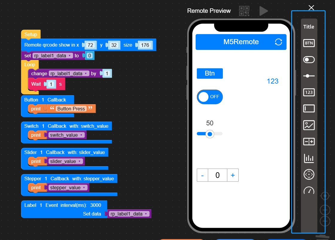
API

lcd.qrcode('https://flow.m5stack.com/remote?id=undefined', 72, 32, 176)Set the position and size of the QR code of the generated web page. Note: After the web page is run for the first time, the remote parameter of the URL in the code will be updated automatically, so this API needs to be run once through UIFlow online mode first.
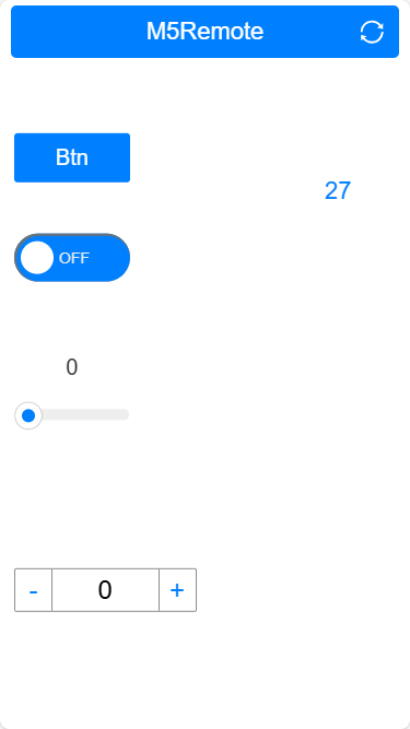
In the program block menu, click Remote+ function, a preview window will appear on the right side of the page for adding controls, users can drag and drop to add controls to the blank space of the page. After all controls have been configured and the program has been pushed, click on the QR code at the top of the preview window to get a link to the control page.
Button

def button_1_callback():
pass- Add a touch button to the control page, every time you add a button, a corresponding Callback function will be automatically generated in the programming area, and the contents of the function will be triggered when the button is pressed.
| Properties | Description |
|---|---|
| Name | Control Title |
| Show Title | Whether to display the control title True/False |
| Color | Title font color |
| Background | Title background color |
| Edges | key edge style. sharp/Pill |
| Style | Setting the Key Fill Style. Outline/Solid |
Switch

def switch_1_callback(switch_value):
print(switch_value)- Add a toggle switch to the control page, every time you add a toggle switch, a corresponding callback function will be generated automatically in the programming area, the content of the function will be triggered when the switch is activated, and the switch state will be passed through the variable
switch_value. The content of the function will be triggered when the switch is activated, and the switch state will be passed through the variableswitch_value. switch_value: 1(ON)/0(OFF)
| Properties | Description |
|---|---|
| Name | Control Title |
| Show Title | Whether to display the control title True/False |
| Off Label | Closed status symbol |
| On Label | Open Status Logo |
| Off Color | Off state font color |
| On Color | Open status font color |
| Off Background | Off state background color |
| On Background | Open state background color |
Slider

def slider_1_callback(slider_value):
print(slider_value)- Add a slider to the control page, every time a slider is added, a corresponding callback function will be generated in the program area, the slider action will trigger the content of the function and pass the switch state through the variable
slider_value. slider_value: can be configured through the Properties. The slider action will trigger the content of the callback function and pass the slider position status through the variableslider_value. slider_value: Configurable value range through Properties.
| Properties | Description |
|---|---|
| Name | Control Title |
| Show Title | Whether to display the control title True/False |
| Show Value | Whether to display the current slider value True/False |
| Color | Slider color |
| Min Value | Slider range min. |
| Max Value | Slider Range Maximum |
Stepper

def stepper_1_callback(stepper_value):
print(stepper_value)- Add a Stepper to the control page, every time a slider is added, a corresponding Callback function will be automatically generated in the programming area, the content of the function will be triggered when the Stepper moves, and the current value state will be passed through the variable
stepper_value.
| Properties | Description |
|---|---|
| Name | Control Title |
| Show Title | Whether to display the control title True/False |
| Min Value | Stepper range min. |
| Max Value | Stepper Range Maximum |
| Step | Set the Step value for each click |
Label

def label_1_callback():
  global rp_label1_data
return rp_label1_data- Add a display tag to the control page, every add a display tag, in the programming area will automatically generate a corresponding Event timer function, the device program will automatically run according to the specified interval to upload data content (default interval is 3000ms), the uploaded content will be automatically updated to display on the page control.
| Properties | Description |
|---|---|
| Name | Control Title |
| Show Title | Whether to display the control title True/False |
| Font Size | Text font size |
| Color | Data text display color |
| Interval(ms) | Data reporting interval/ms |
Joystick

def joystick_1_callback(joystick_x_value, joystick_y_value):
  print(joystick_y_value)
print(joystick_x_value)- Add a joystick control to the control page, every time a joystick control is added, a corresponding callback function will be automatically generated in the programming area, when the joystick control moves, it will trigger the execution of the function and pass the current joystick state through the variables
joystick_x_valueandjoystick_y_value.
| Properties | Description |
|---|---|
| Name | Control Title |
| Show Title | Whether to display the control title True/False |
| Color | Rocker Color |
| Auto Return | Whether to automatically return to the home position when releasing the joystick True/False |
| X Min | Minimum X-axis position value |
| X Max | Maximum X-axis position value |
| Y Min | Minimum Y-axis position value |
| Y Max | Maximum Y-axis position value |
Input

def input_1_callback(input_value):
print(input_value)- Add an input text box to the control page, every time you add an input text box, a corresponding callback function will be automatically generated in the programming area, when the text of the input box is changed, it will trigger the execution of the function and pass the input text through the variable
input_value.
| Properties | Description |
|---|---|
| Name | Control Title |
| Show Title | Whether to display the control title True/False |
| Font Size | Text font size |
| Color | Data text display color |
| Hint | Enter text prompts |
| Character Limit | Input character length limit, default is 8 |
Image

def image_1_callback():
  global rp_img1_url
return rp_img1_url- Add an image control to the control page. When the control page is accessed, the page will fetch the image data from the specified URL at the specified interval (the default interval is 3000ms) and update it to be displayed on the page control.
| Properties | Description |
|---|---|
| Name | Control Title |
| Show Title | Whether to display the control title True/False |
| Interval(ms) | Data reporting interval/ms |
| Fallback URL | URL of the requested image |
Gauge

def gauge_1_callback():
  global rp_gauge1_data
return rp_gauge1_data- Add a dashboard to the control page, each dashboard will automatically generate a corresponding Event timer function in the programming area, the device program will automatically upload the data content according to the specified interval (the default interval is 3000ms), and the uploaded content will be automatically updated and displayed on the page control.
| Properties | Description |
|---|---|
| Name | Control Title |
| Show Title | Whether to display the control title True/False |
| Label | Dashboard Title |
| Color | Dashboard display color |
| Suffix | Dashboard Data Suffix |
| Min Value | Dashboard range min. |
| Max Value | Dashboard range max. |
| Interval(ms) | Data reporting interval/ms |
Chart
Add a chart to the control page, the icon needs to specify the data source via Ezdata function, and it supports to configure the chart refresh interval and the basic style.
2. Ezdata is used in conjunction with Chart, and needs to be used in a way that the data is saved as a
List, Not a Topic3. When you pass data, you need to use a
map (map), which is a map of the data to be used. You need to use map (dictionary) to pass data in the form of key-value. The key needs to correspond to the X, Y Data Source field in the chart control, if it is left empty, the data will not be displayed.| Properties | Description |
|---|---|
| Name | Control Title |
| Show Title | Whether to display the control title True/False |
| Theme | Setting the Chart Topic Light/Dark |
| Color | Setting chart element colors |
| Chart Type | Setting the Chart Type, Bar/Line |
| Interval(ms) | Setting the chart refresh interval |
| Show Legend | Show legend True/False |
| Dataset Name | Configure the dataset name |
| Y Axis Label Suffix | Configure the Y-axis data suffix |
| EzData Token | Configuring the EzData Data Source Token |
| List | Specified List of EzData data source |
| X Data Source | Set a field in the List data as the X-axis content (usually use time as the data to form a historical record) |
| Y Data Source | Setting a field in List data to be the Y-axis content (Usually, monitoring content is used as data to create a trend of data changes) |
| Max Count | Maximum amount of data to be displayed on the current chart |